Highlands Creative

A blog following the creative team of Church of the Highlands.

  • Creative Internships

Tips for Friendly, Teleprompter-Reading Talent

September 30, 2015 by Katie Parker in Beginner, Gear, Production, Pre Production, Shooting

We frequently Periscope as a team, often to discuss a new project we’re doing or technique we’re using (follow us @cothcreative!), and last week, we Scoped from the set of Highlands News to give people a behind-the-scenes look at our shoot. During the broadcast, we had a time of Q&A, and one of the viewers asked for advice in helping on-screen talent appear energetic and friendly while using a teleprompter. It’s a great question, because it’s harder than it looks and often leaves talent frustrated as they try to juggle information, inflection, energy, facial expressions and reading – while trying to look like they’re not actually reading. It’s not a task for the faint of heart!

Here are a few things that might help make it a little easier:

-       Think about the person behind the camera. No, not the shooter, I mean the person you’re talking to on Sunday. What are they thinking, feeling? How can you make them feel more welcome and at home? Use that mentality when sharing the information in the script. Look through the teleprompter and picture that person’s face.

-       Go “up” at the end of your lines. Human nature is to lower your volume, pitch and tone at the end of each sentence. On screen, it translates with really low energy, so be sure to keep your pitch and volume level the same or bring it slightly higher at the end to keep your lines nice and bright.

-       Keep your eyes open. Almost wider than you think is necessary. A lot of people squint when they read, and squinting will keep people from connecting with you. Like they say, the eyes are the window to the soul. Your want people to connect with you!

-       Smile while you talk. This isn’t exactly natural, unless you’re talking about something funny, so practice in front of a mirror. What do you look like when you smile like “this” or “that”? It’s important to know (away from the mirror) what your face looks like when you move it a certain way. Practice makes perfect.

Also, vid teams, help your talent out by writing a friendly, conversational script. It’s a lot easier to appear friendly and conversational when the script is written that way! For reference, practice saying the script aloud as you write it. And never address your audience as a group. Any time you can refer to the viewer in the singular, do it. For example, Never say "Hey Church!" say something like "Thank YOU for joining us."

Hope this helps! Happy news-ing, everyone!


Katie

September 30, 2015 /Katie Parker
2015, 1, news, writing
Beginner, Gear, Production, Pre Production, Shooting
2 Comments

Music for Highlands News

September 09, 2015 by John David Wright in Audio, Beginner, Creative, Post Production, Video

We have been asked a lot recently about where and how we choose music for Highlands News, so I wanted to write a blog post about it! One of the biggest resources for background music for our news has been Hillsong. We play their music all time time in church services, and it also feels really great in the background of our news! On their website, you can buy instrumental versions for most every album they have. Buy the "MP3 Trax" version, and it comes with instrumentals. Here's a couple that we pull from: 

  • Glorious Ruins
  • We Are Young & Free
  • Cornerstone

I've also really loved using two songs off of Taylor Swift's album, Red. There's a legit instrumental version here.

Also, if there's a song that you really think would work well in your news, chances are there is a decent karaoke version on iTunes. Type in the name of the song you are looking for and put the word "karaoke" on the end of your search and start previewing away! We have done this a couple of times with good results. 

For more info about music for video, check out this blog post.

Hope this helps you and your church! Feel free to ask any questions in the comments section below!

September 09, 2015 /John David Wright
2015, Music, 1
Audio, Beginner, Creative, Post Production, Video
2 Comments

Friday Freebie - Free projector Broll

July 10, 2015 by Jake Taylor in Beginner, Creative, Audio, Shooting, Video

Every year we do a series called "At The Movies." And it's huge and epic and crazy and everyone loves it and lots of other churches do it and it's just really fun. That being said we thought we would give away some of the shots we used to make the opener. Specifically the projector and its sfx. We got a 16mm Eiki projector that looks like its from the 70s, brought it in the studio, and shot some nice broll of it. Hazed it up, and used a sock with baby powder in it to create those particles. Just smack it a few times before a shot, the sock that is...not the projector.  

We took the Broll of that projector and cut it up with reverse shots of actual movies being projected on the wall (2013) or in an actual movie theater (2014). We can't give those to you for obvious reasons, but basically what we did was get a bunch of clips from famous movies, put a lot of noise on them to look old and then projected them using a much more modern and HD projector. Then we took a slider and some handheld shots of them. In 2013 we shot it in our little studio and to get the feel that it was in a theater we just grabbed a few office chairs because their silhouettes are close enough. Then in 2014 we actually got into a local theater and that was awesome too. 

Take a look at the openers below and download the footage below that. It's a bit big(1.6gb) but its 15 decently long clips. And if you use it then send us a link! 

Here is 2013. Pretty small shoot for one of my favorite openers. 

Here is 2014. It was hard to haze a whole theater haha

You don't need to credit us with these shots, but please don't sell them anywhere. Also if you do use them somewhere we would love to see it! Feel free to post a link of your work in the comments below.

July 10, 2015 /Jake Taylor
2015, 1, at the movies, movies, broll, freebie, stock, resource
Beginner, Creative, Audio, Shooting, Video
Comment

HEADLINES

June 23, 2015 by Landon Benson in Beginner, Creative, Graphic Design, Web Design

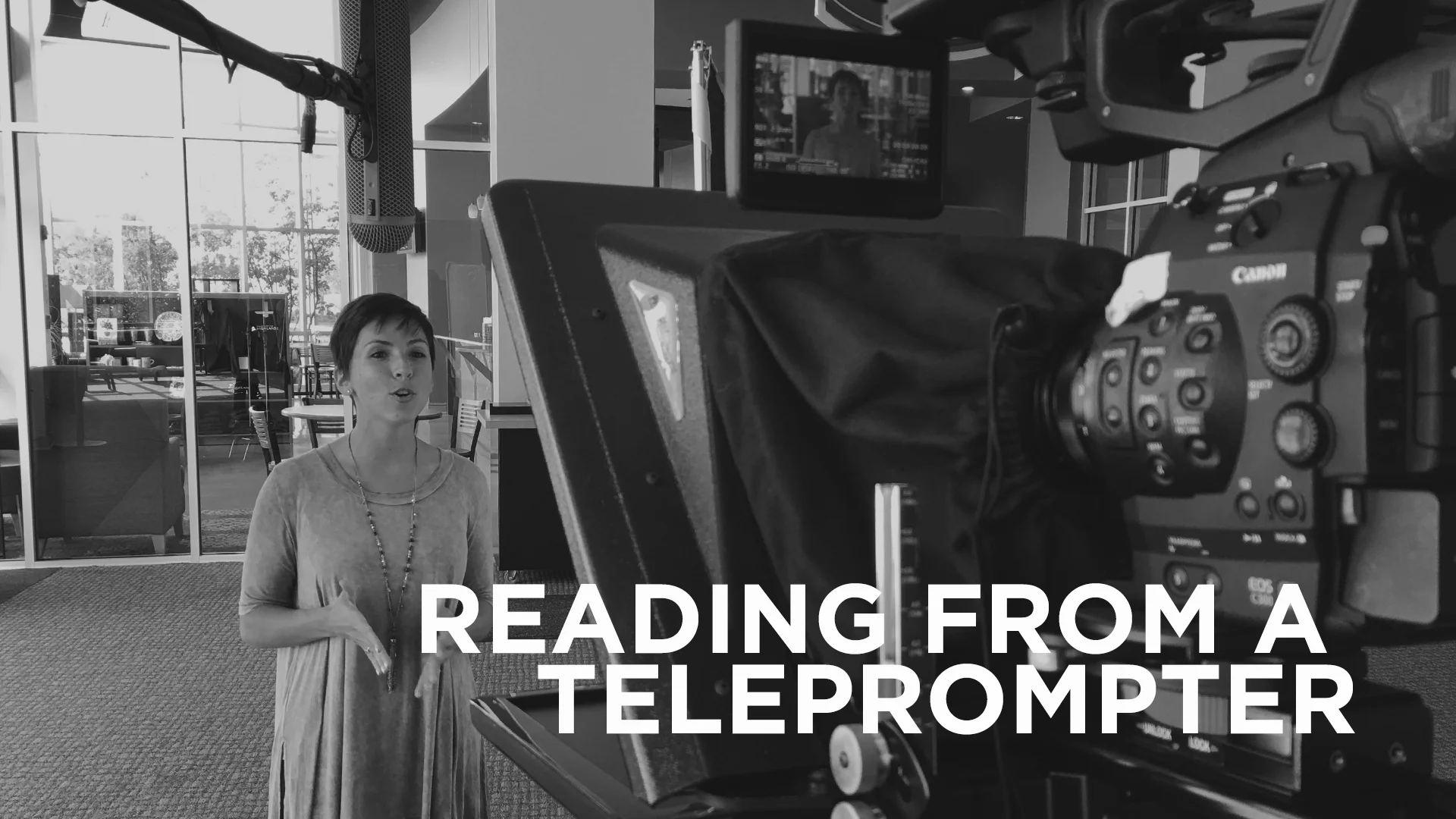
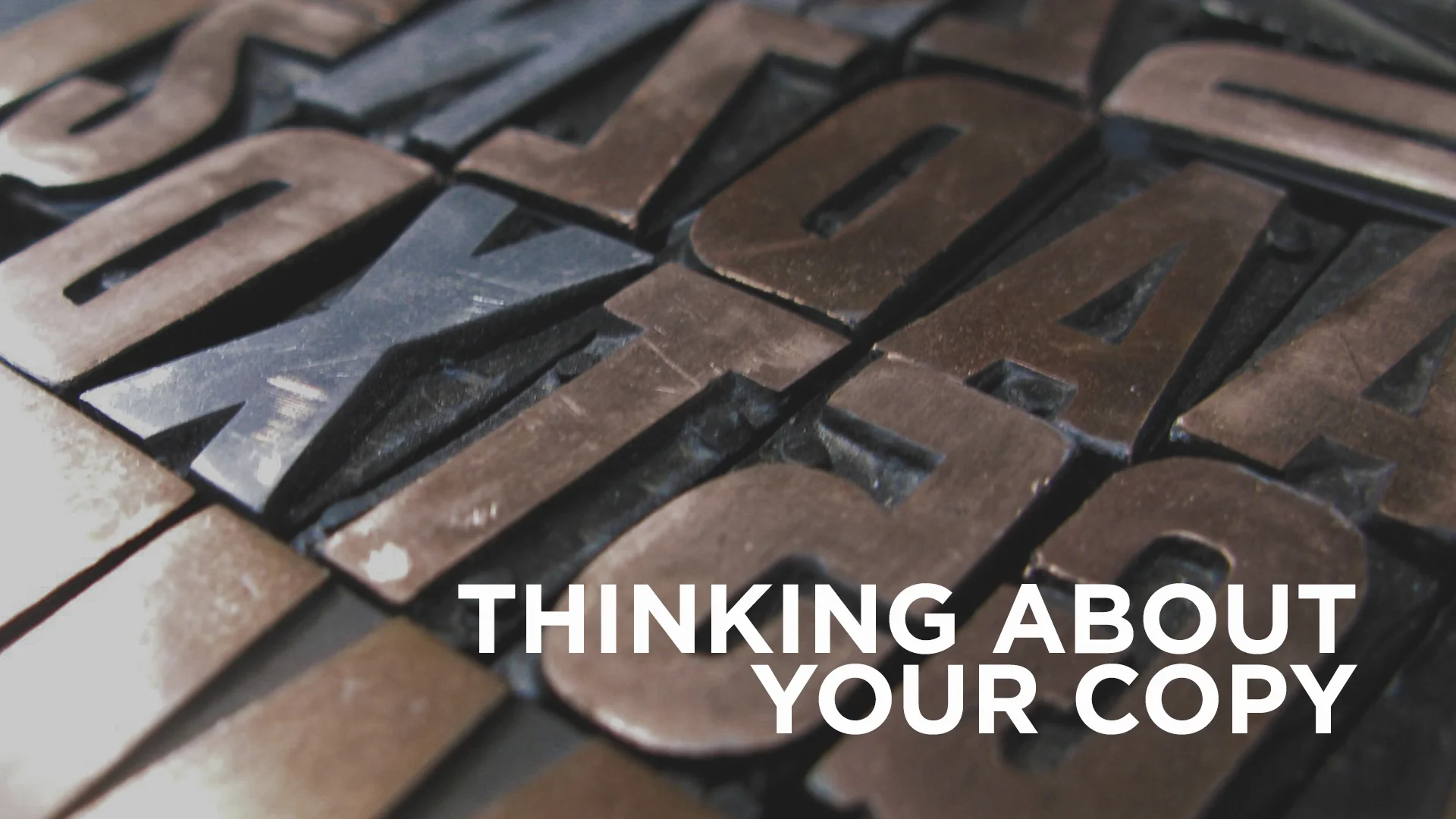
This post is all about title text, or headline text. It’s what draws the viewer in, and begs them to read the rest of the article, ad, or whatever project you happen to be working on. It’s pretty important to make sure this is set correctly. Don’t give the audience an easy excuse not to read. In the last article, the one about copy, you learned how to manage large volumes of text, the meat of a project. Now let’s talk about the pretty bow that goes on top. For the rest of the article, let’s learn some new terms. Here they are: Kerning, Tracking, and Drop Capitals. 

Stop your keming

If you surf the web for inspiration (if not, you should), you have probably seen the running joke about “keming.” Keming is what happens when you fail to kern correctly. Kerning controls the space around the letters of a word. If you kern the word kern incorrectly you get… well… “Kem.” Adjusting your kerning is super easy. The mac short cut is the same in all Adobe software. OPTION bracket left or right adds space between the letters in which your curser resides. I know what you’re thinking. I had the same question. How do I know when I have achieved el kerno perfecto? That… that is the question. 

If you happen to find some mathematical way to achieve it perfectly every time be sure to pass it along. The problem is that not every typeface takes up the same area on the page. If you google that question, you are going to cash up a slew of techniques ranging from kerning upside down to imagining invisible balloons occupying the space between the letters. Basically, you end up having more questions than you did before you even started your research. Here is my advice, get in the habit of studying good kerning. Eventually you will develop an eye for it. It definitely makes life easier when you are using a quality typeface. Most of the typefaces on Font Squirrel will require minimal kerning, but you get what you pay for. Make it a point to be aware of your kerning, even if it is just for a few seconds. If you think you've got killer kerning chops, try this fun game. Google recently made a slight adjustment to their logo. I bet you noticed right? If not check it out here.

Are you tracking with me?

Tracking is one of my favorite things to extenuate. It’s the distance between ALL of your individual letter forms in a word. When you type the word “CREATIVE”, out of the box and with no adjustments, it’s tracking should be zero. The most important thing you can remember about custom tracking is to never exaggerate your tracking with lowercase letters. Try it. Look at how horrible if it reads. Tracking can be increased or decreased for utilitarian, creative, or both reasons. It all goes back to the start. What are you trying to communicate? Are you increasing the tracking just because it looks cool? There’s nothing wrong with that, but could their be a more appropriate way to get your message across? 

So now that you have decided that customized tracking is your way to go, do you beef it up or reign it in? There obviously could be a number of factors that could play into your design choices, but for the beginners, here is a bit of a safety net. If you are working with a typeface that is condensed, meaning tall, negative tracking will look pretty slick. Scooch those letters on up next to one another. Isn't it nice? Now for the latter. If you are using an extended typeface you might think about extending your tracking.

When the cap drops

Have you ever seen the Gutenberg Bible? Check it out really quick and come back. Did you notice the giant letters all painted up at the start of each chapter or section? If you didn't, google illuminated manuscripts. See all of those? Pretty intimidating right? Maybe not. Or, maybe you are a monk who, between painstakingly illustrating the Bible for hours on end, has time to surf a little internet. Odds are you don’t want to use that style in this day and age. The principle is what you should notice. The page is practically calling your name, it’s saying, “Landon… look at me, then read what is next to me.” I'm Landon by the way, nice to meet you. Drop caps are yet another way to direct the viewers interest. Like most elements, it has a time and a place. As a designer, it is up to you to determine when and where that is. There is a fancy way to do drop caps in Indesign, but it is honestly easier to just create your own text box and blow up the point size. You don’t have to be decorative with it. Just remember your original vision and stick with it.

While we are on the subject of capitals, let’s remember one thing. Much like the italics and bold button, the small caps button has potential to destroy a font. Double check your inventory. If you don't have an italics font in your family, it is going to distort and render a horrendous faux italics. It is the equivalent of taking a picture of the Mona Lisa and then applying an Instagram filter to it. Don’t do it. The same goes for small caps. Yes, I know that there is a button. I know that it does it for you. Just check to see if your family has the correct members for such a design. If it doesn’t, all it’s going to do is shrink the letters.

Remember to spend a little extra time when designing your headlines. Who knew that such little amounts of text could play such a large part in how our information is received. Don’t forget to check your kerning, trying some tracking, and make sure all your bases are covered. Now get out there and design some killer headlines.

June 23, 2015 /Landon Benson
2015, 1, typography, type, kerning, headlines, photoshop, illustrator, indesign, graphic design, design
Beginner, Creative, Graphic Design, Web Design
1 Comment

Simple Compositing

June 17, 2015 by Jake Taylor in Beginner, Creative, Post Production, Shooting, Video

Sometimes the shot you want has "stuff" in the way. Maybe you're setting up a testimony and in order to get good boom mic placement you have to sacrifice your wide shot. Or maybe your arms get a little tired and you drop the boom pole into the shot. Or maybe there is a bright "EXIT" sign in the back of the room. There are tons of reasons why your shot could become cluttered and ultimately unusable. But there is a simple fix to all of this and all it requires is a little forethought and a few minutes in After Effects. Take a look at some examples below, sorry they aren't color corrected. 

rach1.jpg
rach2.jpg
tony1.jpg
tony2.jpg
rob1.jpg
rob2.jpg
rach1.jpg rach2.jpg tony1.jpg tony2.jpg rob1.jpg rob2.jpg

As you can see we took a lot out of those images, we removed anything and everything that was distracting to the eye and that didn't add to the overall beauty of the shot. And since the room is a very large room that is hard to haze we even added in some fake light rays.

BUT HOW?

Its easier than you'd imagine. 

1. Plan your shot accordingly. 

When you're setting up your shot make sure nothing you're planning on taking out is "touching" your talent. Don't let an exit sign creep out from behind their head and don't let a chimera or light stand be behind them in your lens. If it's in a corner of the shot or over their head then you're good! Trust me you don't want to find yourself rotoscoping their every move later. You will kick yourself during the edit. But if your subject is one who moves around a lot you may find yourself doing it anyway. 

2. Get a clean plate and don't touch the camera! 

Either before your subject gets into the shot or after you've gotten everything, you need to get a clean shot of the scene without the subject and without the gear. DO NOT TOUCH the camera between filming your subject and getting the plate, even the slightest movement could mess up your shot and hurt you in post. However, if you do shift it a little don't freak out cause you'll still be able to fix it in post but it'll just take longer and be more frustrating. You'll need to get at least 15 seconds if not a minute or two of the clean plate. You need video and not a photo because you want the natural noise of the camera so that it doesn't look jarring on your screen. You're basically going to just duplicate the plate and spread it out over the length of your edit. The plate has nothing in it, its just your scene. No gear, no people. 

Screen Shot 2015-06-10 at 10.51.48 AM.png
Screen Shot 2015-06-10 at 10.51.34 AM.png
Screen Shot 2015-06-10 at 10.51.48 AM.png Screen Shot 2015-06-10 at 10.51.34 AM.png

3. Drop both of them in AE and get to work!

So with the above example it is incredibly easy to fix this in AE. Just drop that clean slate on top and add a simple mask with a little feather. You might also have to play with the brightness because you probably did have lights on in the first shot. 

But, what if your shot is a little more complicated and your slate has an exit sign or a sound booth in it like this:

It's still easy to fix, but you have to spend a little more time on it. There is two different tools to use here. One is the Clone stamp tool, similar to Photoshop's, and the other is replicating part of your scene. What is nice about this is that you don't actually need a clean plate of the scene you can just duplicate your current one. However, I would still get one just in case. 

Clone Stamp: 

Duplicate your footage, and then double click its layer in the timeline panel. You should then be in the "Layer View" which is the second tab of your Preview Window in AE. Make sure your playhead is at the very first frame when you do this. 

From here grab your clone tool, the little stamp in your tools, and play with the brush size until you get exactly what you need. Then alt-click on the part of the footage you want to sample. Release the alt key and then start brushing. Its a good idea to sample several different areas around the area you're removing so that you can get a good mix of the correct colors and it wont look like a smudge on the footage. 

Once you're done click back over to your composition panel, the first tab in the Preview Window, and then ram preview to make sure it looks correct. 

Replication compositing: 

Different than the clone tool but achieves the same result. Duplicate your footage, and then draw a mask around an area in your footage that is similar to the area you're trying to correct.

Screen Shot 2015-06-10 at 11.44.35 AM.png
Screen Shot 2015-06-10 at 11.45.27 AM.png
Screen Shot 2015-06-10 at 11.45.42 AM.png
Screen Shot 2015-06-10 at 11.48.49 AM.png
Screen Shot 2015-06-10 at 11.46.08 AM.png
Screen Shot 2015-06-10 at 11.44.35 AM.png Screen Shot 2015-06-10 at 11.45.27 AM.png Screen Shot 2015-06-10 at 11.45.42 AM.png Screen Shot 2015-06-10 at 11.48.49 AM.png Screen Shot 2015-06-10 at 11.46.08 AM.png

For this example we are wanting to cover the sound booth with a panel that matches the other sound panels on the wall. You can see we actually used another panel and just shifted the position to cover the sound booth. Draw a mask around the area you want to sample and then drag it over and align it. The perspective may be off a bit but you can fix that with a warp or by making the layer 3d and rotating it on the x or y axis. We actually used several other parts of the scene to cover these ugly blemishes. Sometimes it will look great on the first try and others it will take some serious tweaking. The only effects that might be helpful here is "Hue/Saturation" to shift the hue slightly, "Tint" to force the color to match that which it is replacing, and then "Brightness/Contrast" to adjust any changes in light between the two samples. 

4. Hit Render and celebrate

That's it! You're done! Now, while it renders, go celebrate!

Hopefully this short and easy tutorial will help you when you've come into a jam and need to remove that pesky boom pole that keeps dropping in or when you are planning out your shots for an interview style video. One more thing, if you are needing to do this on a moving shot there is a solution. It involves camera tracking and attaching the composite layers (Clone tool and replications) to the track or some other more complicated methods. Here is an old tutorial that still works and here is another tutorial that looks very promising. We'd love to see your work if you end up using this method so feel free to post links below and ask questions! 

June 17, 2015 /Jake Taylor
2015, 1, After Effects, compositing, clone tool, easter, testimony, interview
Beginner, Creative, Post Production, Shooting, Video
3 Comments

The Church and Social Media

June 11, 2015 by Katie Parker in Beginner, Creative, Inspiration, Social

I’m pretty sure the average person couldn’t tell you why they love Facebook, Twitter and Instagram – and they may be reluctant to admit it – but they do, in fact, love it – so much that they can’t seem to stay away from it. Social media is not addictive on a case-by-case basis; almost everyone experiences its magnetic pull. But why? Why is it so difficult to tear our eyes away from the endless stream of photos of sandy beach feet, Starbucks cups, motivational quotes, Throw Back Thursdays, song lyrics, and yesterday’s dinner?

There is a lot of interesting research out there about the scientific reasons for “social media addiction” (i.e. how each post provides a surge of dopamine to our brains), but it all boils down to this: People love social media because it’s “social.” We are living in what Seth Godin calls a “Connection Economy,” where it seems the world is finally waking up to the inherent desire and need for relationship that God placed in us from the very beginning, and people are starting to turn their minds off to anything that does not have a potentially “social” aspect. Thus, impersonal advertising and marketing techniques like billboards and TV ads are losing ground in engagement and, consequently, lucrativeness. The world has abandoned the monologue advertisement of faceless, corporate organizations and turned to social media to find connection and be heard.

While there may be a negative grumble resounding around the fact that the world is fixated on social media, it presents an unprecedented opportunity for companies (and churches!) to interact with their customers (or attendees/members) 24/7, which not only provides an endless stream of helpful feedback, but also creates an opportunity to build relationships, meet needs, and, ultimately, care for people. And that’s what we, as The Church, are all about. We care for people. Social media gives us an ability to hear every voice – and reach a lot of people with the love of Jesus! – if we go about it the right way.

So all of that being said, here is the big way that you can apply this thought process to your Facebook & Instagram feeds:

Post photos, not graphics.

Graphics (e.g. your event logo with service times overlaid on top or even a photo with overlaid event info) are the Ghost of Marketing Past; they are old school, and they are hurting you more than they’re helping you. People are not only disengaged from social media graphics due to their lack of cultural relevance, but they are frustrated that anyone would be so rude as to interrupt their delightful, photographically-issued dopamine experience with a bombardment of unsolicited words, text and information.

Instead of defaulting to an informational graphic, post a crisp, engaging photo of the event or cause you’re promoting (preferably picturing people enjoying said event!) with a punchy caption that will get across the same exact information you would have communicated through a graphic. (Examples: NewSpring, Elevation, Highlands). This allows people to keep their brains happy media-wise while also connecting with you, your event, and your church’s personality. As you gain their trust over time by allowing them to get to know you as a church through photographical windows, they may eventually give one of your events a shot.

Nobody really wants to be sold anything, and this is the beauty of The Church becoming properly active on social media: We’re not selling anything. We’re trying to connect people with others (which is what they want) and with Jesus (which is what they need). Our goals with social media need to be centered on building relationships, meeting needs, caring for people, and connecting them with the personality of our churches. The more authentically we can do this, the more effective we will be in communicating the love of God to this connection-driven world.

Let's make our posts count.

Katie

June 11, 2015 /Katie Parker
2015, 1, social media, instagram, facebook, twitter, social
Beginner, Creative, Inspiration, Social
2 Comments

Are you ready for Grow?

June 09, 2015 by Creative Team in Creative, Beginner, Video, Production, Pre Production

Its almost here! Our annual Grow conference is nearly here and we want to give you all a preview of what we will be covering and hear from you all personally!

What is Grow?

Grow is our annual leadership intensive. It consists of general sessions and dozens of breakout labs that focus on specific ministry areas. The labs are designed to help provide hands-on training, as well as give attendees practical insights into how ministry happens at Church of the Highlands. Labs are designed with intentionality to allow both the training needed to understand the systems, structures and key components that make up a ministry area as well as ample time for question and answer. It is our goal to ensure that every attendee leaves resourced and with every question answered.

How can I go? 

Well this years sessions are already completely sold out! But, if you missed us this time around, you will be able to register for next years conference beginning in August!

I'm coming! What can I expect?

If you're coming then get ready to have an awesome time and hopefully learn a lot in the process. We will be doing several creative labs ranging from utilizing social media, to the creative process, to creating videos for a church experience, and maybe even some unplanned breakouts during lunches or breaks. Also, you'll want to follow us on Twitter and Instagram so we can communicate to you during the conference. We will tweet about where you can find us during lunch and maybe even a Periscope broadcast or two. 

What are we going to talk about in labs? 

A lot of times we get really basic questions like what camera should I buy, what software should I use, etc. While there is nothing wrong with those questions we don't want to spend everyone's lab time answering them. Thats why we have this blog. You can see what gear we use, and recommend for a tight budget. You can see what software we use. You can see how we do our news, or how we set up interviews. There are so many answers to questions you might have, right here on the blog. And if you cant find something or you just want to chat then shoot us an email. Also, if you just really want to discuss the newest gear and tech or how your church is transitioning from Hi8 then try and connect with us before or after the labs. We are down with tech talk but we don't want to bog down the lab discussing what new camera or plugin we like. So basically what I am saying is that we want the labs to go deeper than the basic questions. We are gonna address why we do what we do, how we do it here at Highlands, how our practices can apply to your church and bunch of tips and tricks we've learned along the way. We also are going to open up the floor for your questions and our hard drives for your requests. You will be able to ask us how to write jokes for a sunday video, how we set up a dolly shot for a testimony, what brand of cereal we prefer and so much more. You will also be able to ask us for just about anything we've ever made, (most of which is already on the Grow Resource site), from recent years. We try not to give away stuff that is outdated and out of touch with the current creative landscape of the church or that has a bunch of our people in it. But, we will gladly hand over anything and everything we can, if we can find it haha. 

Questions? Suggestions? 

We want both. If there is something you'd like to see us teach, some process you want to know, or you just want to see the behind the scenes of some video; then please ask us! Like now! Drop us a comment below or a tweet or chat us on AIM. Ok, don't chat us on AIM, we don't remember our password. But do contact us and let us know what you want to see in the labs. We do this conference for you guys so we want to make sure to answer everything you guys could ask! So for real, tell us what you want to see at Grow and we will try to make it happen. 

One more thing, if there is a post you'd like to see on this blog or if we are talking about something at grow and you'd like to be able to reference it later via the blog then let us know and we will make a post about it!


June 09, 2015 /Creative Team
2015, 1, grow, preview, conference, creative
Creative, Beginner, Video, Production, Pre Production
3 Comments

Typography: Do you copy?

May 06, 2015 by Landon Benson in Beginner, Creative, Graphic Design, Web Design

Now that you've begun to view fonts in a new light, it is time to dig a little deeper. If you have yet to read the first typography post I highly recommend you give it a peek. It’s all about seeing past the words themselves and appreciating individual letterforms as harmonious and intricately formed shapes. Now that we’ve gotten that out of the way let’s talk about some basic principles. Having a good foundation early on enables you to break the rules and get away with it.

Do you copy? Probably.

Odd’s are you have probably heard the word “copy,” or the process of “copy-writing.” Copy writing is challenging and It takes a special kind of person to do it well. It’s basically the content or words that you (as the designer) are given to work with. In a menu it is everything from the item names, to the descriptions of said items. It could also be the “about us” paragraph on your church’s website. It is a broad term. So why am I talking about this? Basically it is the engine to your car. The hot air to your balloon. The beating heart to your project. Without it we become artist’s and not designers. There is indeed a difference. Art's communication is heavily dependent on what the viewer wants it to say, while design should communicate exactly what we (creatives) want it to say. The vehicle for that communication? Copy. Yes, there is a large degree of art to what we do, but that is a different discussion. Now back to copy. At Highlands, the words we print and post are mulled over and read on multiple levels. This insures the highest probability of communicating correctly what we want to say.  That word “correctly” is key.

How we copy.

Here is an example of the communication process: Our staff small groups team, drafts the vision and passes that along to our art director. Our art director then works with the team to write something that communicates that vision in the best way possible. Once approved, the language is read by several others to hammer out any kinks or things that might be confusing. It is important to get as many eyes on your copy as possible. The last thing you want is to send out the wrong date or have an embarrassing mispeling. Once the copy is finalized, it is then passed down to us (the designers). This is where the fun begins. Most likely it is either too much to handle or not enough. It never is perfect. If it was the perfect amount of copy the first time I think you and I would be out of a job. Let’s face it, that is what we are for. We are problem solvers. So time to solve some problems. I would venture to say that 80 percent of length issues can be resolved by a revision. But there are going to be those times when you just have to make it work. Let’s talk about what to do.

How to use copy.

For simplicity’s sake I am going to talk about print pieces. Web is a whole separate gambit and frankly needs to come from a different brain. Let’s talk about that mailer your pastor asked you for the end of summer. Mailers are great. Everyone loves mailers. It is time for the church to have some good mailers don't you think? Expect a blog post about mailers soon. Most church mailers have this in common. There is usually a large block of text describing something. That’s what we should focus on. But first lets have a vocabulary lesson.

Alignment: The setting of text flow or image placement relative to a page, column (measure), table cell or tab.

Point size: The smallest whole unit of measure in typography.

Leading: The distance between the baselines of successive lines of type.

Baseline: The line upon which most letters "sit" and below which descenders extend.

Widow: A paragraph-ending line that falls at the beginning of the following page or column, thus separated from the rest of the text. 

Orphan: A paragraph-opening line that appears by itself at the bottom of a page or column. And a word, part of a word, or very short line that appears by itself at the end of a paragraph. Orphans result in too much white space between paragraphs or at the bottom of a page.

Do not worry about remembering the difference between orphans and widows. Just remember that they are both bad. 

White-space: The area you think is missing something but is adding everything.

Let’s break typesetting copy down in order of the terms listed about. Alignment should be one of the first choices you make. You have several options here. Left, centered, right, justified are the main ones. It depends wholly on the volume that you are trying to communicate. Center aligning a slew of text ends up being uncomfortable to read. You do want people to read what your saying right? Most people look for an excuse not to read it. Especially in this digital media oriented age. You should make it as comfortable as possible. Save your spice for the headlines. Focus on being precise. Don’t excuse lack of flare for lack of attention when it comes to copy typesetting. If you center align your body of text it loses that solid line the readers eye uses to orient itself. Center justify small amounts of text. This same concept applies to right aligned text. You are better off left aligning or justifying your text. Left aligning is the safest option. The problem you face when fully justifying your text is “rivers.” Rivers are distorted spaces between  your words. 

Here is an EXAMPLE. 

Not very pretty right? You fix this by using hyphens. In most cases you want to refrain from using hyphens cause they are not the most attractive looking marks. They work well with large amounts of copy but so much with very little amounts of copy. 

Now that you have your alignment adjusted, focus on your point size. Your point size is determined by the size of your print piece. If it is a billboard it is going to be pretty large. That is different than lets say a business card. For mailers the smallest size you should set your copy in is typically around 9pt. If you are using a font with a large x-height you are probably okay to use an 8pt. Just like your document size determines your point-size, the culmination of your document size and point-size determines your leading amount. Leading can get a little hairy. Most programs will determine this for you. Adobe does a good job at calculating a figure based off of your point size but it’s normally a weird number. In design school I was taught to use whole numbers as much as possible. Why not? If you leave this post remembering one thing, remember this. Do not compensate for a lack of copy with increased font and leading size. You are hurting yourself. Revel in that white space.

Here are some tips:

  • Avoid large bodies of text in all caps. If everything is important nothing is important.
  • Maintain consistency. Instead of using a completely different font mid paragraph to emphasize a thought, try using a different weight and/or color.
  • Copy and paste. Copy and paste EVERYTHING. It is the saving grace of graphic designers. Most of us can not spel anywaay.
  • Read your copy. Read the first few lines and see if the amount of words per line is comfortable to read.


May 06, 2015 /Landon Benson
typography, design, copy, writing, 2015, 1
Beginner, Creative, Graphic Design, Web Design
1 Comment

Video Recap - Catalyst 2015

April 23, 2015 by Creative Team in Creative, Video

The conference where we turn boys into men, and men into more manly men. Testosterone abounds. Here are all the videos we produced for Catalyst 2015. You're guaranteed to feel more manly after watching.

April 23, 2015 /Creative Team
catalyst, recap, campus pastor, darius, zach, 2015, 1
Creative, Video
1 Comment

EASTER 2015 SOCIAL MEDIA APPROACH

April 16, 2015 by Katie Parker in Creative, Graphic Design

As we were searching for inspiration for how to promote our Easter services via social media, I came across Saddleback's 2014 Easter package. Learn how we used our own shareable images to let our followers promote Easter across social media. 

Read More
April 16, 2015 /Katie Parker
social, media, 2015, 1
Creative, Graphic Design
Comment

Video Recap - Easter

April 07, 2015 by Creative Team in Creative

Watch all the video elements for Easter 2015 here at Highlands.

Read More
April 07, 2015 /Creative Team
easter, story, 2015, 1
Creative
Comment

Friday Freebie - Free Emotive Broll

March 27, 2015 by Jake Taylor in Beginner, Shooting, Video

This months friday freebie involves a hipster, rain, and an all around bad day. If you need some emotive slow motion broll for your next project then this post is for you. 

Read More
March 27, 2015 /Jake Taylor
stock, footage, broll, free, download, freebie., hipster, 2015, 1
Beginner, Shooting, Video
3 Comments

Typography

March 17, 2015 by Landon Benson in Beginner, Creative, Graphic Design, Motion Graphics, Web Design

Have you ever felt overdressed for a party or even perhaps a date? Or what about feeling underdressed for a job interview or meeting that you thought was going to be casual but was actually strictly business? The horror. Most of us have, and it can be a little awkward at times. Of course, you'll get through it, but you're still left feeling a little out of place. That same principle applies to typography. Understanding how to properly use typefaces can make the difference between your designs looking good and your designs looking great.

Read More
March 17, 2015 /Landon Benson
typography, type, serif, sansserif, design, layout, kerning, font, 2015, 1
Beginner, Creative, Graphic Design, Motion Graphics, Web Design
Comment

UPDATED: How to Write and shoot NEWS

March 16, 2015 by Greg McKinney in Creative, Video

At Highlands, we believe giving service attendees a break from the traditional on-stage announcement of upcoming events is a welcome change to the Sunday routine! We have found that an upbeat and energetic announcement video will keep people engaged and from playing on their phones after praise and worship. Over the years we have found that there are a few key elements to making the most of an audience’s attention span through effective script writing and shooting

Read More
March 16, 2015 /Greg McKinney
news, church, announcements, 2015, 1
Creative, Video
1 Comment

How to Export Video from Premiere Pro CC // Beginner

March 10, 2015 by John David Wright in Beginner, Creative, Post Production, Video

Sometimes the most complicated part about learning to edit video is knowing what settings to use while exporting. What codec should I use? What container? Bitrate? Frame rate? In this post, I'm going to cover how we export video to play in our church services on Sunday mornings.

Read More
March 10, 2015 /John David Wright
video, video editing, premiere, premiere pro, adobe, export, exporting, 2015, 1
Beginner, Creative, Post Production, Video
4 Comments

Friday Freebie - 3 Text Presets for After Effects

February 27, 2015 by Jake Taylor in Beginner, Creative, Graphic Design, Motion Graphics

For this first freebie I thought we would give away something that will make animating text in AE a little quicker and easier. I've created three text presets that I use on a regular basis and masked them within some animated paths. 

Read More
February 27, 2015 /Jake Taylor
text, presets, After effects, motion graphics, animation, trim paths., 2015, 1
Beginner, Creative, Graphic Design, Motion Graphics
2 Comments

Video Recap - Dream Team Party // Ignite

February 25, 2015 by Creative Team in Creative, Video

We are on the last leg of a crazy busy season here at highlands. We went from At The Movies, straight into Christmas services, 21 Days of Prayer, and Financial Freedom conference, then into two new series, the Dream Team party and then Ignite. We've got Catalyst and Easter coming up but we have a few weeks to catch our breath and collect our ideas before we crack down and start the grind again. While this season is busy we love it! We get to make some of our best content during these fast paced and high pressure times.

Read More
February 25, 2015 /Creative Team
recap, igntie, dream team, mayhem, story, 2015, 1
Creative, Video
Comment

We Are Hiring a Video Producer

February 24, 2015 by Creative Team in Creative, Post Production, Pre Production, Production, Shooting

The Creative Team at Highlands is in search of a video producer! This position is for the person who loves video. 

Read More
February 24, 2015 /Creative Team
2015, 1
Creative, Post Production, Pre Production, Production, Shooting
Comment

At The Movies - Special Effects with Construction Paper

February 02, 2015 by Jake Taylor in Post Production, Shooting, Video, Gear, Creative

Sometimes after we’ve filmed a video we realize we’ve missed something or we need one more shot to really tell the story. And sometimes that’s after a huge shoot with lots of moving pieces and scheduling, like horses, armor and a crazy location. So you cant really just pack everything up and head back out to shoot. Sometimes you have to fake a shot and sometimes all you have to use is construction paper.

Read More
February 02, 2015 /Jake Taylor
special effects, compositing, green screen, blue screen, 2015, 1
Post Production, Shooting, Video, Gear, Creative
1 Comment

New Year, New Blog

January 13, 2015 by Jake Taylor in Gear, Color, Post Production, Pre Production, Motion Graphics, Web Design, Video, Shooting, Production, Live Production, Graphic Design, Creative

We got a facelift! Thanks to squarespace. But don't worry all of our old content is still available here! 

Read More
January 13, 2015 /Jake Taylor
2015, 1
Gear, Color, Post Production, Pre Production, Motion Graphics, Web Design, Video, Shooting, Production, Live Production, Graphic Design, Creative
1 Comment
 

Email us at video@churchofthehighlands.com

© 2022 Church of the Highlands