Typography
Have you ever felt overdressed for a party or even perhaps a date? Or what about feeling underdressed for a job interview or meeting that you thought was going to be casual but was actually strictly business? The horror. Most of us have, and it can be a little awkward at times. Of course, you'll get through it, but you're still left feeling a little out of place. That same principle applies to typography. Understanding how to properly use typefaces can make the difference between your designs looking good and your designs looking great.
The basics
A great place to start is understanding what kinds of typefaces are at your disposal. It's a pretty big list of classifications, but for our purposes, I'm going to stick to the main two. Serif and Sans Serif. These words might look like they're in a different language, but don't be intimidated, it's pretty easy to understand.
To better understand those words you need to break them down. Serif. Serif is the extra little pieces or points that hang off letters. Sans means without. Boom. It's that simple.
A popular Serif font is Times New Roman. It is what you were taught to set* your papers in during school. A popular San Serif font is Helvetica. No. It is not one of the forbidden spells in Harry Potter. Yes. It is quite fun to say. Helvetica exists in your iPhone and on road signs. It's even got its own movie. It is a perfectly respectable typeface. Respectable. I would refrain from using Helvetica because it is everywhere.
Much like people, typefaces can come in various shapes, sizes, and a wide range of predetermined personalities. Thankfully, there a few things that are not subjective. Meaning, one font conveys a certain message over another font, and you can sleep soundly on that foundation. One of your jobs, as a designer, is to understand that message and match it to the message you're trying to convey through your personal or professional work.
By design, Serif fonts tend to look more traditional and old. This by no means is a bad thing. It just depends on what you're trying to communicate. San serif fonts tend to look more modern and clean. Sometimes you want that, and sometimes you don't. The important question is, does it say what you want it to say?
Literally, that sounds like a stupid question. Of course it says what I want it to say. I typed "The Book of James." It reads "The Book of James."
I'm going to ask something a little weird of you. I want you to see past the spelling. I want you to think visually about the letters. Individual letters. I want you to open illustrator and type your name. Make it like 300 point size. Look at all the curves. Look at the proportions. Look at how the letters sit next to each other. Look at how they interact. If you picked Helvetica you should be drooling. Okay... Maybe not. But you should at least begin to see shapes and not just letters. Forms. Elegantly crafted.
A tiny brief history
The Crystal Goblet is an essay on typography by Beatrice Warde. Don't read it. It's a lot to read. It's not for us. It basically says that typography should be seen as a crystal goblet. Meaning you should not be aware of it (it being your font choice). It is simply a vessel that carries information from the writer to the reader. That is the mindset of a writer.
I am betting you are not a writer/copywriter by nature. Most designers are not the best spellers. Instead, you should think about type as image. A designer by the name of David Carson revolutionized the design world back in the late 80's and early 90's. He fully embraced this philosophy, and in the process created a little thing by the name of grunge typography. Basically, he valued the little, precious details that separated one typeface from another. Eventually, your eyes will be trained in the same manor.
What now?
Tools like Photoshop, Illustrator, and frankly, the Internet played a huge role in the design of typography. There are thousands, if not millions, of typefaces out there for the picking. It is up to you, the designer, to sort through the good from the bad.
Here are a few websites the team utilizes for typefaces:
Font squirrel is a fantastic and free resource. The curators over at Font Squirrel do a lot of sifting for you. The site lets you search by category and a tagging system is set in place.
Lost type is another great resource. It is a pay what you want site. It has a smaller collection that gets updated periodically. It is worth a gander.
Creative bloq is a great resource for fonts. They have a running article of the 100 “best” free fonts.
Dafont is at the bottom of my list. I personally would avoid Dafont. If you are looking for a niche style font for your Mexican themed potluck, this site is perfect. However, the curators at Dafont, if they exist, do not really protect you from poorly designed fonts.
If you have some money set aside for fonts, this site is a pretty good place to start looking. They have a great selection of moderately priced fonts.
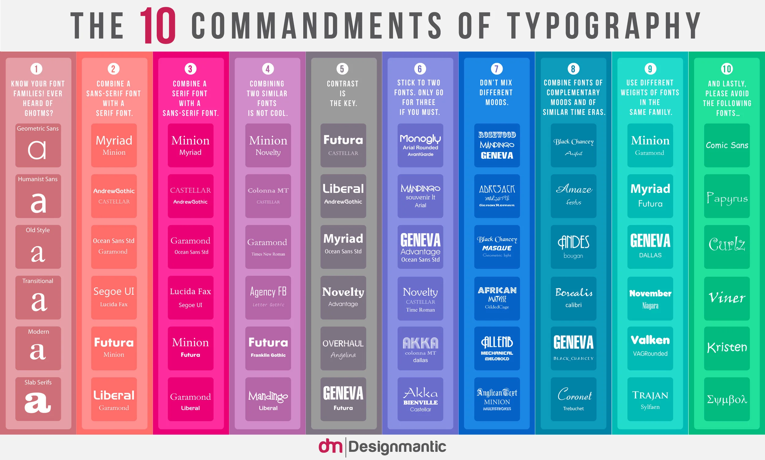
I firmly believe in understanding how to properly use typography. At Highlands, we have students in our creative track come in and hang out or work among the team. We have stations set up around the office with computers that they are most welcome to use. I found a typography poster online that I thought was appropriate and clever, but discussed some crucial points about typography. I set it as the wallpaper image on all the computers.
Here it is:
It takes a little bit of time to adjust your thinking in regard to this area of design. Sometimes it means sacrificing personal preference for the greater good. Meaning, if you just love Papyrus... You must let it die. Please. Please let it die.


